最近想通过进度条记录绘画进度,于是打算抄写一下代码,
打开chrome,由于度娘搜索出来的结果不出所料的垃圾语焉不详,只好到codepenctrl+c借鉴,
迅速找到可借鉴目标,莫得感情的开始ctrl+v写代码

本想着直接抄了事,然而在用主题并不支持jq,又要写头疼的js
在themes\hugo-theme-stack\layouts\partials\article\components\footer.html输入
<script>
    (function() {
      var current_progress = document.getElementsByClassName("current-progress");
      var dynamic = document.getElementsByClassName("dynamic");

       for(let r=dynamic.length-1;r>-1;r--) {
        dynamic[r].style.width=current_progress[r].innerHTML + "%";
          dynamic[r].setAttribute("aria-valuenow",current_progress[r].innerHTML);
          dynamic[r].innerHTML=current_progress[r].innerHTML+ "% Complete";
       }

    }());
</script>
写完之后,并没有出现理想的结果
原来css还要支持boostrap,继续搬运

在assets\scss\partials\layout\artcle.scss输入
      @-webkit-keyframes progress-bar-stripes{from{background-position:40px 0}to{background-position:0 0}}@-o-keyframes progress-bar-stripes{from{background-position:40px 0}to{background-position:0 0}}@keyframes progress-bar-stripes{from{background-position:40px 0}to{background-position:0 0}}.progress{height:20px;margin-bottom:20px;overflow:hidden;background-color:#f5f5f5;border-radius:4px;-webkit-box-shadow:inset 0 1px 2px rgba(0,0,0,.1);box-shadow:inset 0 1px 2px rgba(0,0,0,.1)}
      .progress-bar{float:left;width:0;height:100%;font-size:12px;line-height:20px;color:#fff;text-align:center;background-color:#337ab7;-webkit-box-shadow:inset 0 -1px 0 rgba(0,0,0,.15);box-shadow:inset 0 -1px 0 rgba(0,0,0,.15);-webkit-transition:width .6s ease;-o-transition:width .6s ease;transition:width .6s ease}
      .progress-bar-striped,.progress-striped .progress-bar{background-image:-webkit-linear-gradient(45deg,rgba(255,255,255,.15) 25%,transparent 25%,transparent 50%,rgba(255,255,255,.15) 50%,rgba(255,255,255,.15) 75%,transparent 75%,transparent);background-image:-o-linear-gradient(45deg,rgba(255,255,255,.15) 25%,transparent 25%,transparent 50%,rgba(255,255,255,.15) 50%,rgba(255,255,255,.15) 75%,transparent 75%,transparent);background-image:linear-gradient(45deg,rgba(255,255,255,.15) 25%,transparent 25%,transparent 50%,rgba(255,255,255,.15) 50%,rgba(255,255,255,.15) 75%,transparent 75%,transparent);-webkit-background-size:40px 40px;background-size:40px 40px}
      .progress-bar.active,.progress.active .progress-bar{-webkit-animation:progress-bar-stripes 2s linear infinite;-o-animation:progress-bar-stripes 2s linear infinite;animation:progress-bar-stripes 2s linear infinite}
      .progress-bar-success{background-color:#47cf9b}
      .progress-striped .progress-bar-success{background-image:-webkit-linear-gradient(45deg,rgba(255,255,255,.15) 25%,transparent 25%,transparent 50%,rgba(255,255,255,.15) 50%,rgba(255,255,255,.15) 75%,transparent 75%,transparent);background-image:-o-linear-gradient(45deg,rgba(255,255,255,.15) 25%,transparent 25%,transparent 50%,rgba(255,255,255,.15) 50%,rgba(255,255,255,.15) 75%,transparent 75%,transparent);background-image:linear-gradient(45deg,rgba(255,255,255,.15) 25%,transparent 25%,transparent 50%,rgba(255,255,255,.15) 50%,rgba(255,255,255,.15) 75%,transparent 75%,transparent)}
      .progress-bar-info{background-color:#5bc0de}
      .progress-striped .progress-bar-info{background-image:-webkit-linear-gradient(45deg,rgba(255,255,255,.15) 25%,transparent 25%,transparent 50%,rgba(255,255,255,.15) 50%,rgba(255,255,255,.15) 75%,transparent 75%,transparent);background-image:-o-linear-gradient(45deg,rgba(255,255,255,.15) 25%,transparent 25%,transparent 50%,rgba(255,255,255,.15) 50%,rgba(255,255,255,.15) 75%,transparent 75%,transparent);background-image:linear-gradient(45deg,rgba(255,255,255,.15) 25%,transparent 25%,transparent 50%,rgba(255,255,255,.15) 50%,rgba(255,255,255,.15) 75%,transparent 75%,transparent)}
      .progress-bar-warning{background-color:#f0ad4e}.progress-striped .progress-bar-warning{background-image:-webkit-linear-gradient(45deg,rgba(255,255,255,.15) 25%,transparent 25%,transparent 50%,rgba(255,255,255,.15) 50%,rgba(255,255,255,.15) 75%,transparent 75%,transparent);background-image:-o-linear-gradient(45deg,rgba(255,255,255,.15) 25%,transparent 25%,transparent 50%,rgba(255,255,255,.15) 50%,rgba(255,255,255,.15) 75%,transparent 75%,transparent);background-image:linear-gradient(45deg,rgba(255,255,255,.15) 25%,transparent 25%,transparent 50%,rgba(255,255,255,.15) 50%,rgba(255,255,255,.15) 75%,transparent 75%,transparent)}
      .progress-bar-danger{background-color:#d9534f}
      .progress-striped .progress-bar-danger{background-image:-webkit-linear-gradient(45deg,rgba(255,255,255,.15) 25%,transparent 25%,transparent 50%,rgba(255,255,255,.15) 50%,rgba(255,255,255,.15) 75%,transparent 75%,transparent);background-image:-o-linear-gradient(45deg,rgba(255,255,255,.15) 25%,transparent 25%,transparent 50%,rgba(255,255,255,.15) 50%,rgba(255,255,255,.15) 75%,transparent 75%,transparent);background-image:linear-gradient(45deg,rgba(255,255,255,.15) 25%,transparent 25%,transparent 50%,rgba(255,255,255,.15) 50%,rgba(255,255,255,.15) 75%,transparent 75%,transparent)}
大致结束,不过由于是markdown写作,引入进度条就要写一大堆html,未免太不优雅,
于是在themes\hugo-theme-stack\layouts\shortcodes\bar.html输入
<div class="progress">
    <div class="dynamic progress-bar progress-bar-success progress-bar-striped active" role="progressbar" aria-valuenow="0" aria-valuemin="0" aria-valuemax="100" style="width: 0%">
      <span class="current-progress">{{index .Params 0}}</span>
    </div>
  </div>
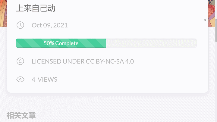
直接输入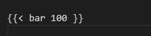 会有以下效果